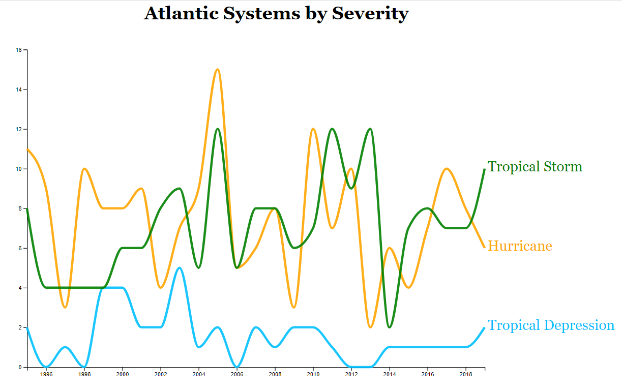
Line graphs are one of the oldest and simplest visualizations. Draw a dot at every data point and connect them. Despite the ease of creation on paper, line graphs are tricky to implement with D3. I started learning D3 with scatter plots and bar charts. Those visualizations expect each data point to be represented by a row in a CSV file. However, to draw a line, D3 uses the SVG path element which is one continuous path derived from an array of coordinate pairs. In this case, each row of the CSV would have to contain every data point associated with a line which is unwieldy. This is where the D3 Nest function comes in handy. It takes in a vertically oriented dataset and groups it by key.
Let's say I want to plot the number of tropical depressions, tropical storms, and hurricanes in the Atlantic ocean each year. I only need 3 data columns. The year signifies where on the x-axis the data point will appear. The severity is the key which maps the data point to a line. The count is the y-axis complement to the year. This vertical organization pattern is more efficient for a computer to process and follows the Tidy Data principles.

Before I plot the line graph, I want to explain the result of invoking D3 Nest. The function returns a JSON object that has keys of type String for each storm severity. Each corresponding value is an Array of Arrays. The inner arrays each contain an entire row of data from the CSV file. D3 will traverse the Array of Arrays and use the data within to draw the path.
Creating a multi line plot is remarkably similar to a single line plot once the data has been organized. Instead of providing data for a single line, I simply pass the entire nested data object to the line generator as shown in the below code excerpt. The line generator draws a line for each key in the nest; they are separate SVG objects that can be interacted with individually.
    lines.selectAll(".line")
        .data(nestedData)
        .enter()
        .append("path")
        .attr("class", "line")
        .attr("d", function(d,i) {
          return lineGenerator(d.values);
        })
        .style("fill","none")
        .style("stroke", function(d,i) {
          return colors[i];
        })
        .style("opacity", .9)
        .style("stroke-width",4);
In the end, the data refuted my belief that the number of hurricanes per year has increased over time and that's ok! I continued working on the visualization and added labels and formatted the axis ticks. Check out my gist if you are interested in seeing the source code.